
The Default Divide
Related in this series (Privacy & Control): The Cookie Loophole-Loophole — another look at how the small, "neutral" defaults of the modern web quietly steer the people using it.
Most consumer-facing websites — news portals, e-commerce stores, marketing pages, and social platforms — launch with light mode as the default. Dark mode is available only as an optional toggle, usually respecting the browser’s prefers-color-scheme media query.
In contrast, backends, admin panels, developer consoles, internal dashboards, and coding tools overwhelmingly ship with dark mode enabled by default. This split is now common enough to feel like a law of nature — but it is a convention, not a requirement, and conventions carry assumptions worth examining.
It is worth being precise about what’s actually true before we read meaning into it. The headline claim that “dark mode reduces eye strain” turns out to be mostly context-dependent and partly false: for the large share of the population with normal or corrected-to-normal vision, the controlled research generally finds light mode (dark text on a light background) easier and faster to read, not harder.[3][4] So before we get to status and psychology, the design convention rests on a comfort story the evidence only partly supports.
Real-World Examples
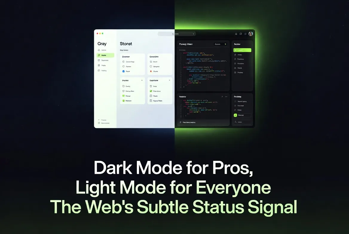
- Light-first frontends: Amazon, The New York Times, Shopify storefronts, and most SaaS landing pages open in bright, clean light mode.
- Dark-first backends: the Vercel dashboard, the Supabase console, many AWS and GCP internal consoles, terminal emulators, and popular admin dashboard templates ship dark by default.
- The split inside one product: the most telling cases are tools that wear both faces. A marketing homepage in light mode that leads to a developer dashboard in dark mode is making a statement about who arrives at each door — even though it is literally the same company, the same brand, and often the same user.
The pattern is consistent: tools built for prolonged, focused work tend to go dark, while interfaces built for quick browsing or broad audiences stay light. It is worth noting this is a recent norm. Early GUIs were overwhelmingly light (the “document on paper” metaphor), and the dark IDE only became a cultural default in the 2010s as code editors like those in the VS Code lineage shipped dark themes out of the box. The convention we now treat as obvious is barely a decade old.
The Official Rationale
Designers cite reduced eye strain for long sessions. Developers and analysts often stare at screens for 8–12 hours. Dark backgrounds lower overall screen luminance — a white page on a typical monitor emits on the order of a few hundred cd/m2, and dropping most of that to near-black genuinely reduces the total light hitting the eye, which can feel more comfortable in a dim room at night. The assumption is simple: “This user is a pro who will be here a while, so we optimize for endurance.”
Two caveats are worth flagging up front, because the rationale leans on them. First, the blue-light part of the story is weaker than commonly assumed: the strongest evidence for blue-light harm concerns circadian disruption (sleep timing) rather than retinal damage or eye strain, and reducing screen brightness or using night-shift colour temperature addresses that more directly than inverting the colour scheme. Second, “less light = less strain” is only half the picture; legibility depends on contrast polarity, and on that axis the advantage flips the other way (see the next section).
Light mode remains the default for frontends because it tends to maximize readability in typical office or daylight environments — bright surroundings wash out a dark screen — and because it conveys approachability and trust to first-time or casual users. The Nielsen Norman Group’s own user research finds the audience itself is roughly split: about a third keep their devices in dark mode, about a third in light, and the rest switch by context, which is a strong argument against treating either as the universally correct default.[2]
What the Research Actually Shows
The eye-strain argument is context-dependent, not universal — and on the single most-studied measure, raw legibility, it actually runs against dark mode for most people.
The clearest, most replicated finding in the literature is the positive-polarity advantage: across multiple controlled studies, people read dark text on a light background (positive polarity = light mode) faster and more accurately than light text on a dark background (negative polarity = dark mode). Piepenbrock, Mayr, and Buchner reported medium-to-large effect sizes for both reading speed and accuracy in favour of positive polarity, and a companion study measured smaller pupil diameters and better proofreading performance in light mode.[3] The Nielsen Norman Group’s review of this evidence concludes plainly that “light mode leads to better performance most of the time” for users with normal or corrected vision.[1]
That does not make dark mode worthless — it makes its benefits conditional. The table below summarizes where each mode tends to win:
| Condition | Light Mode Advantage | Dark Mode Advantage |
|---|---|---|
| Bright ambient light | Better readability and faster reading for most users[3] | Little; bright surroundings wash out the low-luminance screen |
| Dim / low-light environments | Screen can feel glaring against a dark room | Lower total light output; often more subjectively comfortable |
| Long reading tasks (normal vision) | Higher accuracy and faster processing[3] | Sometimes lower perceived workload, but not better measured performance[1] |
| Astigmatism (~1 in 3 adults) | Sharper letter edges; avoids the halation "glow"[5] | Often worse — bright text on dark can shimmer or smear |
| Older users | Generally lower mental effort in bright rooms | Mixed; cognitive load varies by ambient light and age[7] |
| Cloudy ocular media (e.g. cataracts) | Glare from a bright field can scatter and reduce contrast | Reduced light scatter can genuinely help[1] |
The astigmatism point deserves emphasis because it directly contradicts the “dark mode is gentler on the eyes” folklore. Roughly one in three adults has some degree of astigmatism, and for them bright text on a dark background is prone to halation — light bleeding past the edges of each glyph so characters look fuzzy, glowing, or shimmery — which makes dark mode harder to read, not easier.[5] Where dark mode does have a defensible visual-comfort case is for users with cloudy ocular media such as cataracts, where reducing the overall light field cuts down on scatter.[1]
Eye-tracking and cognitive-performance studies broadly support this: Sethi and Ziat’s eye-tracking work found that negative polarity (dark mode) raised cognitive load — visible as longer search times and larger pupil diameters — for older adults in bright rooms and younger adults in dim rooms, underscoring that the “best” mode depends jointly on the user and the lighting.[7] A more recent eye-tracking study on dark versus light themes likewise measured higher user workload under dark themes for the tasks tested.[4] The honest summary: dark mode shines for low-light comfort and subjective preference during long sessions, and it genuinely helps some impaired-vision users, but for legibility and measured performance among the general, normal-vision population, light mode tends to win. It is not universally superior — and neither is dark.
One more thread ties this to accessibility standards rather than taste. Whatever polarity you choose, the WCAG 2.1 contrast-minimum criterion requires a contrast ratio of at least 4.5:1 for normal text (3:1 for large text).[6] A common dark-mode mistake is pure white text on pure black, which is technically high-contrast but can intensify halation; design guidance generally recommends slightly off-white text on a dark-grey (not jet-black) surface to keep the ratio compliant while taming the glow.
The Mechanism: Why Polarity Matters
It is worth understanding why light mode tends to read better, because the reason is physiological rather than aesthetic. A brighter overall field (light mode) makes the pupil contract. A smaller pupil reduces spherical aberration and increases depth of field, so the retinal image of the text is sharper — which is exactly what improves legibility and is the mechanism researchers credit for positive polarity’s reading-speed and accuracy gains.[1][3] The same effect explains the astigmatism penalty in dark mode: a larger pupil (in a dark field) lets in more of the eye’s own optical imperfections, amplifying the smearing that halation already causes.[5]
Two honest counterweights keep this from being a blanket “always use light mode” verdict. First, the performance gap is measured in seconds and percentage points over reading-heavy tasks — for glanceable dashboards full of charts and status lights rather than prose, it largely evaporates, which is part of why dashboards get away with going dark. Second, NN/g notes a speculative long-term consideration: sustained bright-light exposure has been associated with myopia progression, so the short-term legibility win is not automatically a lifelong health win.[1] The responsible reading of the evidence is “it depends,” not “dark mode is a myth.”
Choosing Defaults Responsibly
If no mode wins universally, the design takeaway is not “pick the right one” but “stop hard-coding a default that encodes an assumption about your user.” A few concrete practices follow directly from the research:
- Honour
prefers-color-scheme. The operating system already knows the user’s stated preference and time-of-day context. Respecting it ships the right default to roughly two-thirds of people who have an opinion, for free.[2] - Offer a visible, persistent toggle — not buried in settings — and remember the choice. The research’s central finding is that the population is split, so the only universally correct answer is let them choose.
- Design dark mode properly if you ship it: off-white on dark grey, not white on black; keep contrast at or above the WCAG 4.5:1 floor; and avoid thin or light-weight fonts, which suffer most from halation.[6]
- Match the mode to the task, not the audience’s imagined status. Long-form reading leans light; glanceable, chart-heavy, low-light monitoring leans dark. That is a functional decision — and, as the next section argues, it is too often made for non-functional reasons.
The Psychological Status Signal
This technical choice carries a subtle message.
Dark mode has become cultural shorthand for “power user” and “serious work.” It feels modern, focused, exclusive, and sophisticated. Receiving a dark interface can make users feel respected as experts.
Light mode, while more readable and trustworthy in many contexts, can feel mass-market or “basic.” When a frontend forces light mode (or a backend feels unusually bright), some users internalize the friction — slower reading, higher mental effort, or visual discomfort — as personal failure rather than design intent. The interface quietly suggests: “We built this for average users, not pros like you.”
It is not that the site literally calls anyone stupid. It is that the default mode hierarchy creates an unconscious status gradient: dark = capable insider, light = casual outsider. Users notice this on a gut level even if they cannot articulate it.
There is a small irony buried here. The convention sells itself on comfort and expertise, yet the research suggests the “expert” dark dashboard is often the less legible of the two for the majority of eyes reading it.[1][3] The signal, in other words, is doing cultural work that the ergonomics do not back up. That is exactly what makes it a status signal rather than a usability decision: its persistence is explained better by what it communicates than by how well it performs.
This connects to the broader theme of this series. Like a cookie banner whose “Reject all” button is hidden two clicks deep, a hard-coded colour default is a small design choice that quietly encodes a judgment about the person on the other side of the screen — and, like the cookie banner, it works precisely because most people never consciously register it. The remedy is the same in both cases: surface the choice, respect the user’s stated preference, and stop letting a convenient default stand in for consent.
Key Takeaways
- Backend dark defaults signal “we expect expert, long-session use”; frontend light defaults prioritize broad accessibility and trust.
- The “dark mode reduces eye strain” claim is only partly true: for normal-vision users in typical lighting, light mode (positive polarity) is generally read faster and more accurately.[1][3]
- Dark mode’s real wins are narrower than the folklore: low-light comfort, subjective preference, and some impaired-vision cases (e.g. cataracts) — while it can be worse for the ~1 in 3 adults with astigmatism due to halation.[5]
- Cognitive performance is context-dependent — no mode wins universally, and the audience itself is roughly split, which is the strongest argument for honouring
prefers-color-schemeand shipping a real toggle.[2] - Whatever you ship, meet the WCAG 4.5:1 contrast minimum and prefer off-white-on-dark-grey over white-on-black.[6]
- The dark/light split reinforces a subtle expertise hierarchy that the ergonomics do not actually justify; choose defaults consciously rather than following convention.
Conclusion
The web’s dark/light split is not merely a technical or accessibility decision. It is a quiet statement about who the product believes its user to be. The evidence is clear enough to puncture the comfort story the convention tells about itself — light mode is generally the more legible choice for most eyes most of the time — and clear enough to refuse the opposite overcorrection, because dark mode genuinely helps in low light, suits glanceable interfaces, and is the right call for some users’ vision. What it does not justify is being silently imposed as a marker of who belongs.
So the practical conclusion is modest and falls back on respect: detect the user’s stated preference, expose an obvious toggle, design both modes to the same accessibility bar, and let the human decide. As more interfaces ship in 2026, understanding this psychological layer helps designers build with intention — and helps users recognize when an interface is quietly shaping how capable they feel, before they even notice.
Sources
- Budiu, R. — Nielsen Norman Group (2020). "Dark Mode vs. Light Mode: Which Is Better?" (positive-polarity advantage for normal vision; pupil/aberration mechanism; cataract and myopia caveats).
- Nielsen Norman Group (2023). "Dark Mode: How Users Think About It and Issues to Avoid" (the roughly even split of user preference and context-switching behaviour).
- Piepenbrock, C., Mayr, S., & Buchner, A. (2014). "Positive Display Polarity Is Particularly Advantageous for Small Character Sizes," Human Factors; and Piepenbrock et al. (2014), "Smaller pupil size and better proofreading performance with positive than with negative polarity displays," Ergonomics.
- An Eye Tracking Study on the Effects of Dark and Light Themes on User Performance and Workload (2025), Proceedings of the 2025 Symposium on Eye Tracking Research and Applications (ETRA).
- Smithsonian / Stoney Creek Optometry — overview of "Is Dark Mode Better for Your Eyes?" (astigmatism prevalence and the halation effect that makes dark mode harder to read for many).
- W3C Web Accessibility Initiative — "Understanding Success Criterion 1.4.3: Contrast (Minimum)" (the 4.5:1 / 3:1 contrast thresholds).
- Sethi, T. & Ziat, M. (2023). "Dark mode vogue: do light-on-dark displays have measurable benefits to users?" Ergonomics, 66(12) (eye-tracking cognitive-load analysis across age and ambient-light conditions).
Comments
Comments are powered by Giscus (GitHub Discussions).
Enable functional cookies to load comments.